UDF Configuration: Difference between revisions
(Updated based on version 4.0.02.00) |
(Updated based on version 4.0.02.29) |
||
| Line 38: | Line 38: | ||
* Description - the UDF description, for reference. | * Description - the UDF description, for reference. | ||
* Config Type - a drop-down list of all the different types of UDF configuration. Select from: | * Config Type - a drop-down list of all the different types of UDF configuration. Select from: | ||
** Arrival Terms and Conditions for Collections | ** ''Arrival Terms and Conditions for Collections'' | ||
** Arrival Terms and Conditions for Deliveries | ** ''Arrival Terms and Conditions for Deliveries'' | ||
** Container UDF | ** ''Container UDF'' | ||
** Driver Terms and Conditions for Collections | ** ''Driver Terms and Conditions for Collections'' | ||
** Driver Terms and Conditions for Deliveries | ** ''Driver Terms and Conditions for Deliveries'' | ||
** Driver Terms and Conditions for Services | ** ''Driver Terms and Conditions for Services'' | ||
** Job Details | ** ''Job Details'' | ||
** Load End Metric | ** ''Load End Metric'' | ||
** Load Start Metric | ** ''Load Start Metric'' | ||
** Product UDF | ** ''Product UDF'' | ||
** Service Diagnosis | ** ''Service Diagnosis'' | ||
** Service Info | ** ''Service Info'' | ||
** Service Post-work | ** ''Service Post-work'' | ||
** Service Pre-work | ** ''Service Pre-work'' | ||
** Terms and Conditions for Collections | ** ''Terms and Conditions for Collections'' | ||
** Terms and Conditions for Deliveries | ** ''Terms and Conditions for Deliveries'' | ||
** Terms and Conditions for Services | ** ''Terms and Conditions for Services'' | ||
** Terms and Conditions for Vehicle Checks | ** ''Terms and Conditions for Vehicle Checks'' | ||
** Vehicle Checks | ** ''Vehicle Checks'' | ||
** Job Cancellation | ** ''Job Cancellation'' | ||
** Container Cancellation | ** ''Container Cancellation'' | ||
** Container Clause | ** ''Container Clause'' | ||
** Product Cancellation | ** ''Product Cancellation'' | ||
** Product Quantity Change | ** ''Product Quantity Change'' | ||
** Service Cancellation | ** ''Service Cancellation'' | ||
** Service Item Cancellation | ** ''Service Item Cancellation'' | ||
** ''Subform'' | |||
* Key Type - a drop-down list of the key level the configuration is applied. One of S (Site), J (Job Group), P (Product Group/Model), V (Vehicle Type), R (Reason Code). Only some values are allowed for the different config types. | * Key Type - a drop-down list of the key level the configuration is applied. One of S (Site), J (Job Group), P (Product Group/Model), V (Vehicle Type), R (Reason Code). Only some values are allowed for the different config types. | ||
* Key Value - a drop-down list of the key values for the key type selected. For example, if this is Job Group, this drop-down list will show all job groups for the site. | * Key Value - a drop-down list of the key values for the key type selected. For example, if this is Job Group, this drop-down list will show all job groups for the site. | ||
| Line 77: | Line 78: | ||
Fields may be added to a form by clicking the '''New Field''' button, with the following values: | Fields may be added to a form by clicking the '''New Field''' button, with the following values: | ||
* ID - a unique identifier for the field on the form. | * ''Data-bound Field'' - a drop-down list of all data from the Load, Job, Container or Product information, or information from the device. The available fields are limited by the Config type of the form being created. So, if Load Metrics are being created, only Load level information is available. The device-level information is always available and consists of the following: | ||
* Type - a drop-down list of field types. Select from: | ** ''Current Date'' | ||
** Text - a simple in-line text box. | ** ''Current Time'' | ||
** Numeric - a simple in-line number entry box. | ** ''Timezone'' | ||
** CheckBox - a check box, starting unset by default, allowing Checked (Tick) or Unchecked (Cross). | ** ''GPS'' | ||
** CheckBox List - a grouped list of CheckBox fields. | ** ''ID'' | ||
** Tri-State CheckBox - a check box, starting unset by default, allowing Checked (Tick), Unchecked (Cross) or Not Applicable (N/A). | ** ''Type'' | ||
** Tri-State CheckBox List - a grouped list of Tri-state CheckBox fields. | ** ''Locale'' | ||
** Drop-down List - a drop-down list of values. | ** ''Country'' | ||
** Textarea - a larger text box for large text entry, automatically growing in size on the mobile device application (e.g. notes). | ** ''Language'' | ||
** Label - a text label. | * ''ID'' - a unique identifier for the field on the form. This is required to be unique on the form. If a data-bound field is selected, this will be pre-populated. | ||
** Photo - a photo bar, allowing multiple photos to be taken on the form. | * ''Type'' - a drop-down list of field types. Select from: | ||
* Label - A text label for the field, typically on the left of the field. If this is a grouped checkbox list, this will appear as a title before the individual checks. | ** ''Text'' - a simple in-line text box. | ||
* Sub-Label - a smaller piece of text below the main label. | ** ''Numeric'' - a simple in-line number entry box. | ||
* Group - a text ID which groups fields. Deprecated. | ** ''CheckBox'' - a check box, starting unset by default, allowing Checked (Tick) or Unchecked (Cross). | ||
* Post Text - A small text label under the value to be entered. Typically used for UOMs. | ** ''CheckBox List'' - a grouped list of CheckBox fields. | ||
* Required - a check-box denoting whether a non-blank value must be entered in or selected for the field. | ** ''Tri-State CheckBox'' - a check box, starting unset by default, allowing Checked (Tick), Unchecked (Cross) or Not Applicable (N/A). | ||
* Action - a drop-down list of actions allowed for this field. | ** ''Tri-State CheckBox List'' - a grouped list of Tri-state CheckBox fields. | ||
* | ** ''Drop-down List'' - a drop-down list of values. | ||
* | ** ''Textarea'' - a larger text box for large text entry, automatically growing in size on the mobile device application (e.g. notes). | ||
** ''Label'' - a text label. | |||
* | ** ''Photo'' - a photo bar, allowing multiple photos to be taken on the form. | ||
** ''Button'' - a button, which can trigger a subform. Buttons may not be added to subforms. | |||
* ''Label'' - A text label for the field, typically on the left of the field. If this is a grouped checkbox list, this will appear as a title before the individual checks. | |||
* ''Sub-Label'' - a smaller piece of text below the main label. | |||
* ''Group'' - a text ID which groups fields. Deprecated. | |||
* ''Post Text'' - A small text label under the value to be entered. Typically used for UOMs. | |||
* ''Required'' - a check-box denoting whether a non-blank value must be entered in or selected for the field. | |||
* ''Action'' - a drop-down list of actions allowed for this field. | |||
* ''Validation'' - A Regular Expression (RegExp) validation string, to validate the entered data on text, numeric or text area fields. {{Warning}} This is advanced functionality and should only be attempted with knowledge of Regular Expressions. | |||
For ''Action'', this is dependent on the field type. For normal fields, select from: | |||
* ''None'' - no actions | |||
* ''Barcode'' - displays a barcode button after the label. If clicked, this will start the Camera Barcode Scanner as part of the application, and will place the scanned value into the field value. {{Note}} If the mobile device has a built-in scanner, this action can be ignored - the device scanner can be used to scan the value when the field value is selected (for text and numeric entry fields). | |||
* A list of GS1 Barcode AIs available for text, numeric and text area fields. | |||
* ''Photo'' - displays a photo button after the label. If clicked, this will start the camera and allow a photo to be taken linked to the field. | |||
For ''Button'' fields, the screen will display a list of available sub-forms to attach to the button. | |||
Drop-down Lists (DDL) and Check-box List types require entry of the options - an Items table will be displayed showing the details, allowing entry of: | Drop-down Lists (DDL) and Check-box List types require entry of the options - an Items table will be displayed showing the details, allowing entry of: | ||
| Line 122: | Line 137: | ||
Up to 2 buttons can be created based on 3 button types, selected from the Button Type drop-down list: | Up to 2 buttons can be created based on 3 button types, selected from the Button Type drop-down list: | ||
* Complete - a button to complete and save all changes. Validation is applied. | * '''Complete''' - a button to complete and save all changes. Validation is applied. | ||
* Cancel - a button to cancel the screen - no changes are saved. | * '''Cancel''' - a button to cancel the screen - no changes are saved. | ||
* Ignore - a button to complete and save the form, marking it as ignored. Validation is not applied | * '''Ignore''' - a button to complete and save the form, marking it as ignored. Validation is not applied | ||
The details of the button can be added through the following configuration: | The details of the button can be added through the following configuration: | ||
* Text - the button label | * ''Text'' - the button label | ||
* Confirm Message - if this is set, when the button is clicked, a confirmation message will be displayed on the mobile device application with this text and '''OK''' and '''Cancel''' buttons. | * ''Confirm Message'' - if this is set, when the button is clicked, a confirmation message will be displayed on the mobile device application with this text and '''OK''' and '''Cancel''' buttons. | ||
Buttons may be saved onto the form using the '''Update Button''' button. | Buttons may be saved onto the form using the '''Update Button''' button. | ||
Revision as of 14:14, 29 November 2018
This screen allows the users to maintain the UDF (User-Defined Forms) configurations within the system.
These UDF configurations are attached to certain stages of operation of the mobile device application, that extend the data that can be entered on the device and therefore the use of the system. These customer forms can vary from a single field to multiple data entries, and even control additional buttons on the mobile device application.
This page provides functionality to View, Create and Edit UDF Configurations.
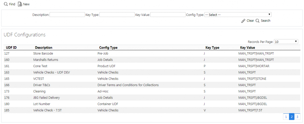
The screen allows users to filter data by:
- Description
- Key Type - To what key level the configuration is applied. One of S (Site), J (Job Group), P (Product Group/Model), V (Vehicle).
- Key Value - a text box to select the key value. This may be a job group, product group, etc - all will be matched.
- Config Type - a drop-down list of all the different types of UDF configuration.
Once the filter information is entered and the Search button is pressed, all matching configurations are displayed in a table below.

UDF Configurations Search Panel and Results table
A single line is displayed per configuration found.
Details shown are:
- UDF ID - a unique identified for the configuration, automatically generated by the system.
- Description - the UDF description.
- Config Type - the type of UDF configuration.
- Key Type - To what key level the configuration is applied. One of S (Site), J (Job Group), P (Product Group/Model).
- Key Value - the key value associated to the key type. This may be a site, job group, product group, etc
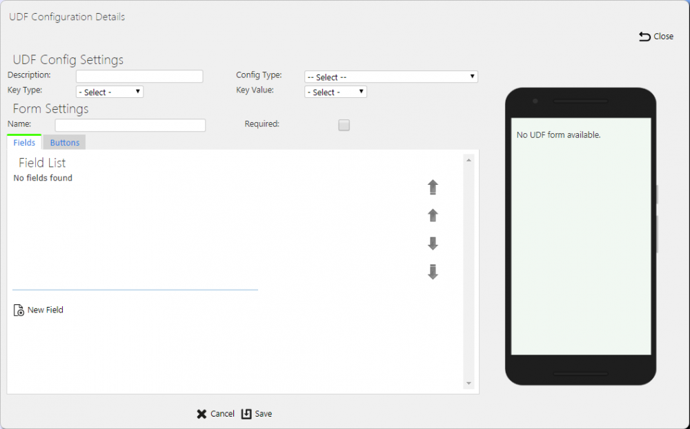
New UDF Configurations
The screen allows new UDF configurations to be created, by pressing the provided New button at the top of the screen.
The following UDF Configuration Settings may be entered:
- Description - the UDF description, for reference.
- Config Type - a drop-down list of all the different types of UDF configuration. Select from:
- Arrival Terms and Conditions for Collections
- Arrival Terms and Conditions for Deliveries
- Container UDF
- Driver Terms and Conditions for Collections
- Driver Terms and Conditions for Deliveries
- Driver Terms and Conditions for Services
- Job Details
- Load End Metric
- Load Start Metric
- Product UDF
- Service Diagnosis
- Service Info
- Service Post-work
- Service Pre-work
- Terms and Conditions for Collections
- Terms and Conditions for Deliveries
- Terms and Conditions for Services
- Terms and Conditions for Vehicle Checks
- Vehicle Checks
- Job Cancellation
- Container Cancellation
- Container Clause
- Product Cancellation
- Product Quantity Change
- Service Cancellation
- Service Item Cancellation
- Subform
- Key Type - a drop-down list of the key level the configuration is applied. One of S (Site), J (Job Group), P (Product Group/Model), V (Vehicle Type), R (Reason Code). Only some values are allowed for the different config types.
- Key Value - a drop-down list of the key values for the key type selected. For example, if this is Job Group, this drop-down list will show all job groups for the site.
The following Form Settings may be entered:
- Name - This may be used on the mobile device application as the title of the screen or form in some instances.
- Required - whether the form is required entry. This affects certain forms, for example Container and Product UDF.
 Note: For Job UDF, this will be a drop-down list and will allow configuration of "When Amended", which indicates that the form is only required to be entered when the job is amended i.e. a container has been cancelled or a product quantity has been changed on the job.
For vehicle checks, the following additional Form Settings are available:
- Frequency (Days) - the number of days between checks being enforced.
- Required at Load End - whether the checks are also prompted for at the end of executing a workload.
- Signature - whether a signature is prompted for after checks are complete.
Fields may be added to a form by clicking the New Field button, with the following values:
- Data-bound Field - a drop-down list of all data from the Load, Job, Container or Product information, or information from the device. The available fields are limited by the Config type of the form being created. So, if Load Metrics are being created, only Load level information is available. The device-level information is always available and consists of the following:
- Current Date
- Current Time
- Timezone
- GPS
- ID
- Type
- Locale
- Country
- Language
- ID - a unique identifier for the field on the form. This is required to be unique on the form. If a data-bound field is selected, this will be pre-populated.
- Type - a drop-down list of field types. Select from:
- Text - a simple in-line text box.
- Numeric - a simple in-line number entry box.
- CheckBox - a check box, starting unset by default, allowing Checked (Tick) or Unchecked (Cross).
- CheckBox List - a grouped list of CheckBox fields.
- Tri-State CheckBox - a check box, starting unset by default, allowing Checked (Tick), Unchecked (Cross) or Not Applicable (N/A).
- Tri-State CheckBox List - a grouped list of Tri-state CheckBox fields.
- Drop-down List - a drop-down list of values.
- Textarea - a larger text box for large text entry, automatically growing in size on the mobile device application (e.g. notes).
- Label - a text label.
- Photo - a photo bar, allowing multiple photos to be taken on the form.
- Button - a button, which can trigger a subform. Buttons may not be added to subforms.
- Label - A text label for the field, typically on the left of the field. If this is a grouped checkbox list, this will appear as a title before the individual checks.
- Sub-Label - a smaller piece of text below the main label.
- Group - a text ID which groups fields. Deprecated.
- Post Text - A small text label under the value to be entered. Typically used for UOMs.
- Required - a check-box denoting whether a non-blank value must be entered in or selected for the field.
- Action - a drop-down list of actions allowed for this field.
- Validation - A Regular Expression (RegExp) validation string, to validate the entered data on text, numeric or text area fields.
 Warning: This is advanced functionality and should only be attempted with knowledge of Regular Expressions.
For Action, this is dependent on the field type. For normal fields, select from:
- None - no actions
- Barcode - displays a barcode button after the label. If clicked, this will start the Camera Barcode Scanner as part of the application, and will place the scanned value into the field value.
 Note: If the mobile device has a built-in scanner, this action can be ignored - the device scanner can be used to scan the value when the field value is selected (for text and numeric entry fields).
 - A list of GS1 Barcode AIs available for text, numeric and text area fields.
- Photo - displays a photo button after the label. If clicked, this will start the camera and allow a photo to be taken linked to the field.
For Button fields, the screen will display a list of available sub-forms to attach to the button.
Drop-down Lists (DDL) and Check-box List types require entry of the options - an Items table will be displayed showing the details, allowing entry of:
- Text
- Value - (Only for DDLs)
- Default - (Only for DDLs)

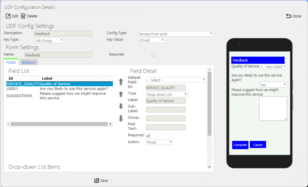
Drop-Down List UDF Configuration
New items can be added using the Add button.
Fields may be saved onto the form using the Update Field button.
Fields can be moved up or down on the form using the buttons provided.
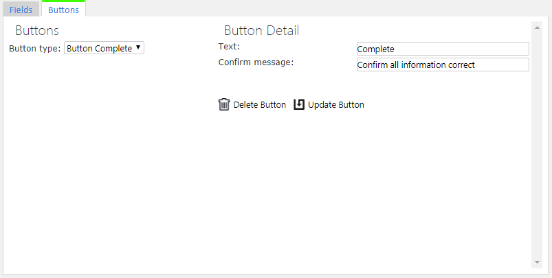
Buttons can be added to the form for Service Pre- and Post-work and Pre-Job forms. Click the Buttons tab to create these.
Up to 2 buttons can be created based on 3 button types, selected from the Button Type drop-down list:
- Complete - a button to complete and save all changes. Validation is applied.
- Cancel - a button to cancel the screen - no changes are saved.
- Ignore - a button to complete and save the form, marking it as ignored. Validation is not applied
The details of the button can be added through the following configuration:
- Text - the button label
- Confirm Message - if this is set, when the button is clicked, a confirmation message will be displayed on the mobile device application with this text and OK and Cancel buttons.
Buttons may be saved onto the form using the Update Button button.
Buttons may be deleted from the form using the Delete Button button.
A preview of the form being created is shown on the right.
A Save button is provided to save the entered data. Clicking Close or Cancel will discard the new UDF configuration.
View/Edit UDF Configurations
The configurations can be viewed and edited by clicking the Select button against the line in the table. The screen will display a pop-up showing all the details of the UDF configuration.

View/Edit UDF Configuration Pop-up
The UDF configuration may be edited by clicking the provided Edit button.
The fields changeable and the action of the pop-up is identical to when adding new UDF forms.
A Save button is provided to save the edited values.
A Delete button is provided to delete the UDF configuration.
Changes may be discarded by clicking the Close or Cancel buttons.

