UG 281363 New CTMS Execution Screen
Solution Overview
A new Execution screen will be created.
The screen will allow all of the functionality of the existing Trip Debrief screen, plus modifications to allow for:
- Extended ODO entry
- Driver Briefing
- Driver Exception Handling
The screen is optimised for each trip status, showing the user the necessary data entries for each step, depending on the status of the order.
Extensive use of pop-ups are used to ensure that the entry of the data is a seamless as possible, directing the user to enter the data in as close a way to the operational requirement as possible.
An increased auditing level will be added, as well as Load ID visibility, to allow users to see how the new functionality would integrate into the existing process.
The styling of the product will approach DHL standards and colour schemes, to show the styling capability of the new product UI.
Efforts have been made to ensure that the system is entirely cross-browser compatible, and touch-screen capable.
Technology
The Web Application is written using the Visual Studio development environment, utilising the following functionality:
- ASP.NET (for forms design)
- Database access tools (access to any database type, including Oracle)
- C# (for server access)
- JavaScript
- AJAX Tool-kit
- Web Services
The system has been written accessing a demo database created in Microsoft SQL Server 2008, the design of which is based on the CTMS Trips and Order tables.
The system is hosted on a Microsoft Windows 2003 server, through IIS 8.
UI Features
Auto-complete - This shows data in the database by matching against the user's entry as they enter it. The functionality provides a seamless lookup system. Note that this is buffered, to prevent unnecessary requests to the database and reduce load.
Tab blocks - These allow panels of data to be shown or hidden by clicking on the tab required. These blocks help make better use of available screen space
Accordion blocks - These allow data to be shown or hidden by clicking on the title bar. These blocks help make better use of available screen space, as an alternative to Tab blocks.
Resizing blocks/data elements - blocks of data are only as big as they need to be, resulting in better use of screen space. Labels and data will resize based on the resolution of the screen, to better support lower-resolution devices. Where the resolution is too low to show all data, scroll-bars are then used, both within panels and for the entire screen.
Validator Call-outs - these display pop-up bubbles next to data that has failed validation, making it easier to validate and enter whole blocks of data without having to submit data several times. As each validation error is cleared, the call-outs will disappear. Note that the call-outs can be created to link through to further screens (for example, to call a maintenance screen to enter data).
Modal Popups - these pop-up screens are used extensively throughout the product. They allow for cleaner entry of data, by expanding and extending the data being entered from the normal screen. They make the entry of data cleaner and easier and enhance readability.
DragPanel - these pop-ups can be dragged around, allowing visibility of the screen behind.
Adjustable Grids - Grids of data can be manipulated when using the screen to show only the data required at this stage. Further, the data in the grids can be paged (to save space), sorted (for ease of use), user-definable (manually choosing columns to display) and editable (for direct data entry into the grid).
Links - web-based systems make extensive use of links. This allows the systems that use them to interoperate between screens without having to add space-expensive buttons.
Map Links - trips can be viewed through Google Maps, showing stops and current position, if available.
Scrolling Marquee - a scrolling marquee is used to show important messages of tasks that need to be actioned. These messages may link to further screens within the system.
Hover Menu - Hover menus are used to display actions required. This saves space, as the options are only displayed when the user hovers over them.
Tool-tips - this is pop-up help that appears when user hover over buttons. This allows individual help text to be placed against each item on the screen, to help beginner users understand their uses.
Masked Edit Boxes - these prevent invalid entry into fields, for example, time are prevented from being entered with invalid times. This is done within the browser and prevents invalid data being submitted to the server, increasing data validation and decreasing server load.
Pop-up Calendar - These show a full calendar and can be styled and ranged, to ensure that only valid date information can be entered.
Additional functionality available but not demonstrated here:
- Drag and Drop
- AlwaysVisibleControl
- Animation
- AsyncFileUpload
- CascadingDropDown
- CollapsiblePanel
- ColorPicker
- ComboBox
- ConfirmButton
- DropDown
- DropShadow
- DynamicPopulate
- FilteredTextBox
- ListSearch
- MultiHandleSlider
- MutuallyExclusiveCheckBox
- NumericUpDown
- PagingBulletedList
- PopupControl
- ReorderList
- ResizableControl
- RoundedCorners
- Slider
- SlideShow
- TextBoxWatermark
- ToggleButton
Note that there is other functionality that can be added as standard (for example, graphs, charts, images) - this list is simply the standard tool-set available to the UI.
Scope
This is a prototype, showing the capability. There is a simplified database in use in the back-end, with demonstration data. It is unlikely that updating data will be required but, where possible, the prototype will incorporate this.
C-TMS Execution Screen
The screen begins by requesting the user to find a trip. This can be through the traditional CTMS mechanism of choosing a schedule and a trip from the drop-down lists provided, or by directly entering a trip in the provided box. Simply typing part of the Trip ID will match all similar trips, which can be selected from the list. This is an example of an Auto-complete entry box.
Once selected (by clicking the provided button), the screen displays the trip details.
The details displayed are relevant to the status of the trip:
- Planned
- Accepted
- En Route
- Complete
- Debriefed
- Confirmed
A top panel is shown to display the current Status of the Trip, allow moving to the next Status, and optionally display an audit history of the trip.
The screen makes use of Accordion blocks for the different areas of data (there are 3 panels: data entry, Orders list and Trip Stops list), and Tab blocks for data entry.
A scrolling marquee is shown, displaying information on tasks to be actioned - each can be clicked, to take the user to a screen pertaining to the task.
Each status of the Trip is covered below, showing the main features.
Planned
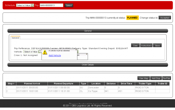
Example: MAN-00000013
A General tab is displayed and open for the Trip, showing general data and allowing the user to enter and view Vehicle and Driver. Drop-down lists are used for these elements. Validation is performed and displayed in-line through Validator Call-outs.
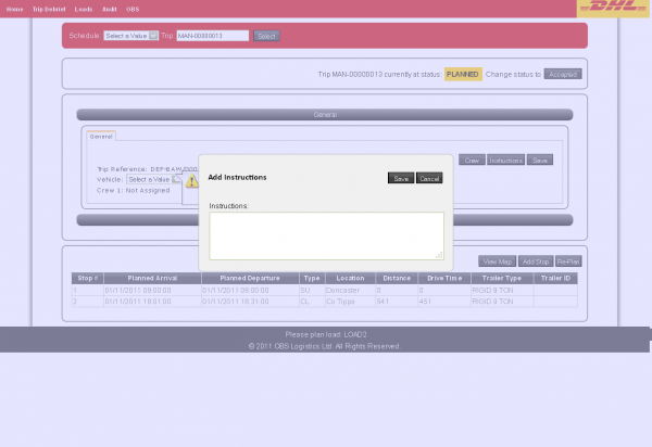
Optionally, the user may enter and view Crew and Instructions information, by clicking on the appropriate button. These are entered and validated through a Modal pop-up screen, allowing dragging of the panels.
When a driver and vehicle have been entered, the user will be prompted to change the status to Accepted if required.
The screen also displays a list of Orders on the Trip. Only the columns required at this stage are shown (for example, no Delivered quantities or POD are displayed at this stage). Note that the grid also shows a link to the Load number associated to the Order - clicking this will allow you to see all orders and trips associated to that load.
A list of Trip stops is shown at the bottom of the screen. Again, all unnecessary columns have been removed, and data cannot be edited at this stage.
Re-plan and Add Stop buttons are available from this point, to call additional screens (not part of prototype).
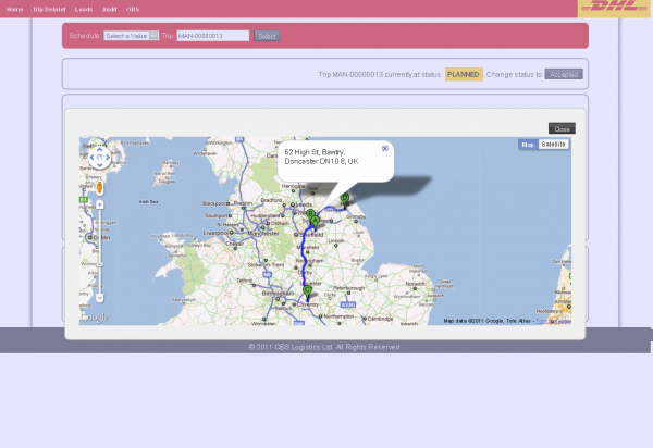
A View Map button is provided, to show details of the stops on the trip and route planning.
Accepted
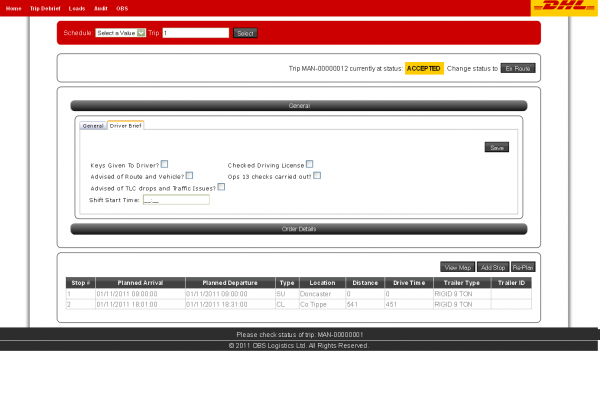
Example: MAN-00000012
A Driver Brief panel is displayed and open for the user to confirm key information about the trip, vehicle and driver before the trip begins. The General tab is still visible if required.
The user is also able to enter the shift start time here. This utilises a masked entry field.
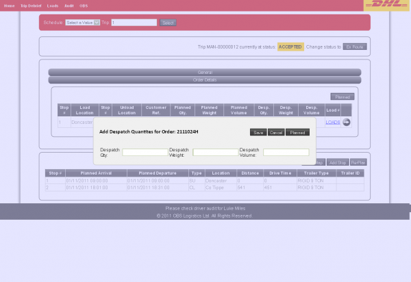
The Orders list now displays Despatch quantities, which are required to be entered before the Trip can be set to En Route - they will be prompted to enter these if they haven't already been entered.
Despatched quantities can be set from planned using the Planned button. Additionally, each order can be edited or set from planned using the Hover Menu against each grid line. Editing a line will show a pop-up window with the information to enter.
Once all data has been entered, the user is able to change the status to En Route by using the button provided.
En Route
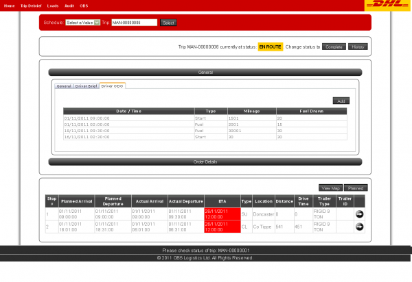
Example: MAN-00000006
From this stage forward, a History button is available to show any audit history against the screen .
A Driver ODO panel is displayed and open for the user to enter Date, Time, Odometer, Fuel and Mileage information. All previous tabs are still visible if required. Dates and Times are through masked entry fields, with the date showing a pop-up calendar control.
The Orders list now displays Delivered quantities, which are required to be entered before the Trip can be set to Complete - the user will be prompted to enter these if they haven't already been entered.
Delivered quantities can be set from despatched using the Despatch button. Additionally, each order can be edited or set from despatch using the Hover Menu against each grid line. Reason codes and comments will be prompted for if there are any discrepancies.
The Trip Stop list now includes Actual arrival and depart dates and times, and ETA Dates and Times.
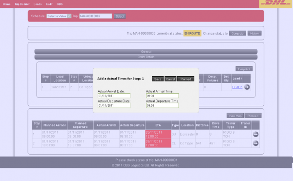
The Actual Dates and Times can be from planned using the Planned button. Additionally, each stop can be edited or set from planned using the Hover Menu against each grid line. Editing a line will show a pop-up window with the information to enter, and a reason code if required. If orders are being delivered against the stop, a pop-up entry window will be shown to enter the delivered quantities against each order delivered.
ETA dates and times are forecast from outside the CTMS system. If they are available, the screen will display these with RAG-colouration:
- If the ETA against a stop is later than the delivery window of any orders associated to that stop, the background is coloured red.
- Otherwise, the background is coloured green.
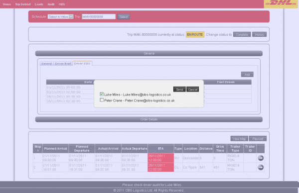
The popup menu on a Red-coloured ETA stop pops up a window allowing the user to email all affected customers with their new ETA.
When all quantities and dates have been entered, the user is prompted as to whether they can change the status to Completed. This can be done through the button at the top of the screen.
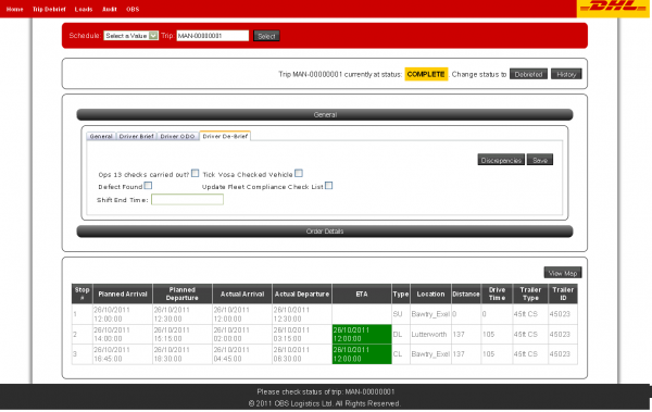
Completed
Example: MAN-00000001
A Driver Debrief panel is displayed and open for the user to confirm key information about the trip, vehicle and driver after the trip ends. All other tabs are still visible if required.
The user is also able to enter the shift end time here. This utilises a masked entry field.
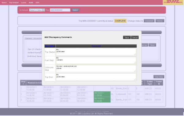
The user is also able to display Driver Discrepancies here, which pops up a window showing all discrepancies (for example, late arrivals, departures, delivered quantity changes) in a grid. A comment can be added per discrepancy.
When all information has been entered, the user is prompted as to whether they can change the status to Debriefed. This can be done through the button at the top of the screen.
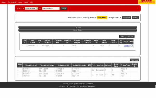
Debriefed
Example: MAN-00000010
The Orders list now displays a POD check, to enter whether PODs have been received for each order.These are required to be checked before the Trip can be set to Confirmed - the user will be prompted to enter these if they haven't already been entered. All PODs can be set as received by using the POD All button.
When all information has been entered, the user is prompted as to whether they can change the status to Confirmed. This can be done through the button at the top of the screen.
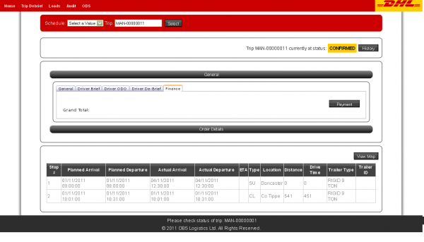
Confirmed
Example: MAN-00000011
A Finance panel is displayed and open for the user to enter Payments information. All previous tabs are still visible if required.
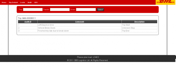
Audit Screen
Example: MAN-00000011
Audit records will written at one of three levels (Trip, Tractor, Driver) at various stages in the process. This screen reports on those records.
The screen allows the user to select through multiple parameters, although only Trip is currently enabled.
When selected, the grid displays all audit records associated to that trip.
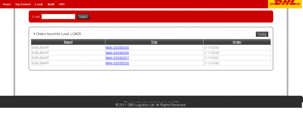
Load Screen
Example: LOAD5
This screen shows all orders associated to the Load ID passed in or selected from the provided auto-complete list.
When selected, the grid displays all orders and trips which are marked against that load.
The grid is configurable (through the Config button and pop-up) and sortable through the column titles.
